How Stretcher Bars Are Made

A stretcher bar is a wooden frame that is used as wooden framework support (usually made from pine) on which an artist fastens a piece of canvas. It provides a steady tension to the canvas and gets the canvas artwork very flat and taut on the frame base, and thus makes it ready to be placed in a picture frame or to simply hang it as is. A stretcher can be bought ready-made as four parts that you just fit together, or you can just buy a pre-stretched canvas at canvaslot.com or you can just do it yourself. Here’s how.
Materials:
• 1×2 inches (2.5-by-5.1 cm) wood (4 pieces)
• Hand saw or power tools
• Miter block
• Staple gun
• quarter-round trim (4 pieces)
• Pencil
• Hammer
• Headless nails (not longer than the width of your quarter-round and 1×2 inch wood combined)
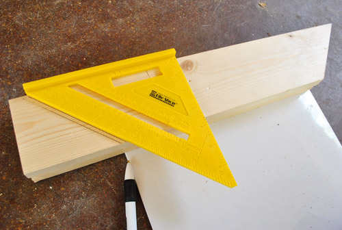
Step 1– Choose the type of wood you want to use. The sides should measure 1 by 2 inches (2.5 by 5.1 cm). Measure the wood according to the desired dimensions then cut with a forty-five degree angle at each end. You can use a miter box to make good, equal, 45 degree cuts at each end so that the wood fits together properly at the corners.
Step 2– Bring together the edges of the cut wood on a flat surface and use powered staple gun to secure the corners by placing 3 staples over the line where the corners come together. Staple the rest of the corners and do this on both front and back of the joints to make the entire frame become very strong and rigid.

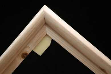
Step 3– Cut the trim pieces with whatever tool you used on the other pieces of wood. Place one flat side of the quarter-round against the stretcher bars, and the other flat side facing outward. The curved edge of the quarter-rounds should be facing inward toward the center of the frame. The purpose of the quarter-round pieces is to raise the canvas off of the stretcher bars. To secure the trims to the frame, nail them with headless nails. Do this by spacing the nails at 4-inch (10.2-cm) intervals to keep it solidly in place.
When the entire frame is finished, it’s time to start stretching the canvas. By stretching your own canvas, you can not only save money, but get something you’re willing to experiment on. You also get a canvas that’s exactly the size you’re after.
Image source: www.younghouselove.com


 by Rembrandt")
 by Francisco Goya")
 by Vinvent van Gogh")
 by Edward Hopper")
 by René Magritte")