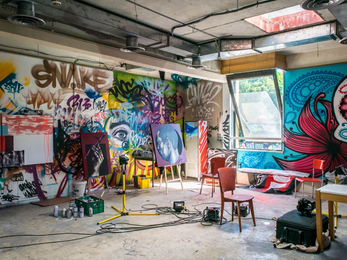
Category: Information

Oil Painting Terms: Part One

Oil Painting Terms
Oil painting has several words that ought to be learned prior to obtaining a brush. Many oil painting terms origin from Latin roots so mispronunciations are very common. Please bear in mind that there may be some variation between the various professionals, organizations and especially between different languages following translation to English. Here are some of the common terms that a new artist should be familiar with.

Oil-painting-essential-materials-techniques-Good-Paints

Abstraction – The process of leaving out of consideration one or more properties of a complex object so as to attend to others.
Acrylic – A type of rapid drying and versatile synthetic paint that is an especially popular with artists working today. The term is also used as a generic term for any synthetic paint medium. Acrylics have good adhesive and elastic properties, they resist ultraviolet light and chemical degradation and are easy to remove with mineral spirits. They are often used in the restoration of damaged oil paintings.
Adumbration – A sketchy, imperfect or faint representation.
Altarpiece – A painted or carved screen placed above and behind an altar or communion table.
Alkyd – Synthetic resin used in paints and mediums to work as a binder that encapsulates the pigment and speeds the drying time.
Alla Prima – Technique in which the final surface of a painting is completed in one sitting, without underpainting. Italian for “at the first”.
Analogous Colours – Colours that are closely related, or near each other on the colour spectrum. Especially those in which we can see common hues.
Applied Art – As distinct from fine art, refers to the application of decoration to useful objects (such as ceramics, furniture, jewelry, etc.)
Aquatint – A method of etching that imitates the broad washes of a watercolour.
Artists’ Agent – A third party who handles the business and promotional aspects of an artist’s career. Many artists’ agents are also gallery owners. Sales agents sell a completed product, whereas artists’ agents tend to also negotiate licensing and publishing deals, organize exhibitions, handle PR and promotion and have some influence on the direction in which an artist’s career develops.
Batik – A painting or design that is applied to cotton using wax and dye. It often comes from the Far East or Africa. It is important to identify the correct way round for the image since the back is very similar to the front. Before stretching, batik should generally be placed between two sheets of brown paper or tissue and ironed; the heat will release any excess wax which will be absorbed by the paper. Batiks do not normally require squaring, as the weave is too close for this to be a problem.
Binder – The ingredient (such as oil, acrylic, egg tempera or gum arabic) in paints that causes the particles of pigment to adhere to one another and to a support.
Brushwork – The characteristic way an artist applies (brushes) paint onto a support producing an individualistic texture as well as aesthetic appeal and value. One of any artists most powerful attributes.

how-to-oil-painting-lessons-colours_pigments
Canvas – Closely woven cloth usually of cotton or linen that is used as a support (surface) for paintings.
Catalogue – A list of works of art often associated with an exhibition or auction that provides information on the works themselves, the artist, the materials and provenance.
Certificate of Authenticity – Certifies the authenticity of an individual piece in an edition and can also state the current market value.
Charcoal – Pure carbon prepared from vegetable or animal substances. Finely prepared charcoal in small sticks used as a drawing implement.
Chiaroscuro – In drawing, painting, and the graphic arts, chiaroscuro (ke-ära-skooro) refers to the rendering of forms through a balanced contrast between light and dark areas. The technique that was introduced during the Renaissance, is effective in creating an illusion of depth and space around the principal figures in a composition. Leonardo Da Vinci and Rembrandt were painters who excelled in the use of this technique.
Commission – To order an original, usually customized work of art from the artist.
Consignment Note – Signed agreements between artists and galleries to confirm that a gallery has taken possession of a painting, but that it the artist’s property until paid for in full. A consignment note represents proof of ownership in the event of an insurance claim, so it should always make clear that the work is insured the gallery while in its possession, whether in transit, at a fair, at a client’s house etc.
Copperplate – An engraving consisting of a smooth plate of copper that has been etched or engraved.
Copyright – The artist retains the copyright in a work regardless of whether the original has been sold. Copyright is separate from the painting itself, and the artist has the right to sell it. Legally, transfer of copyright has to be in writing. Within the EU copyright extends for 70 years after the artist’s death.
Crosshatching – Shading consisting of multiple crossing lines, typically usually used in pencil and ink drawings.

…to be continued

Image source: www.webartacademy.com

Ways to Create Texture to your Arwork

Putting texture in your artwork is a great way of adding a bit more life and character to an otherwise flat area. Brush strokes can create texture but there are other materials that you can use such as an old credit card or a cardboard or alsost anything that you can apply your paint with. The addition of some texture into a painting gives it a whole new dimension. Adding some highly textured areas against some very flat areas gives the painting wonderful contrast. Here are some tricks that you can use to create different textures to your artwork.

textured1

Use some binder medium such as Impasto gel. Glue down the appropriate literature and add three or four good, solid coats of impasto gel, and a glaze or wash or two. Paint over the top of that with an image that is relevant to the text beneath, and allow the text to show through in places. The effect is a three-dimensional aspect to the surface.
Lay down multiple layers of paint. The different layers create a tactile effect on the painting by making its surface less even and smooth. Paint with different paint thicknesses not only by varying the quality and type of paint, but also with how much paint you lay onto the canvas.
Scoop on some modelling compound or something similar material, and create shapes or objects into the surface. This will create lots of wonderful texture.
Stencils are also a great idea. For example, lace is laid on the surface then pulled off after a healthy layer of texture medium of some description, is a lovely experiment. Try laying some clear impasto gel over a finished piece using lace or some patterned material. When it is dry, drag a dry brush over the top, and that pattern will be revealed. Some great patterns can reveal themselves through some very odd household objects.

textured2
Use some shading and contrasting colors to create the impression of texture or to exaggerate an existing texture.
Spattering and stippling techniques can also create a very strong impression of texture because of the uneven layers of paint.

Other mediums & additives like impasto gel & modelling compound have texture and body already built in. A swipe with a palette knife or brush works wonders. These are just some of the ways we can create textured art. Use your imagination. Don’t be afraid to experiment. The range of textured art you can create is limitless.

Image source: www.etsy.com

How to Photograph Your Artwork for Online Display

Online art galleries and portfolios are the thing of today in terms of getting the word out about your art. Showcasing your artwork online needs to approximate the real thing and having good quality images of your artwork is a must. As an artist, you also need to keep visual records of your work—and whether you plan on selling your art right away or keeping it for years, you should always have up-to-date images ready to share.

Position your artwork almost perfectly upright
Put your artwork against a wall where it can stand on its own. It is not recommended that you lay your painting on the floor because it will be difficult for you to take a steady shot and you’ll block your light source that will create a shadow on your picture. When you take the photo, remember to tilt the camera slightly down to match the angle that the artwork is leaning – this will help minimize distortion of the original image.

photographing-artwork

Make sure that you have a sufficient, indirect natural light
Bring your artwork and your camera to a spot that’s full of bright light. Natural light is best. If the sun is too bright directly, bring your piece to a slightly shady area that’s still quite bright. If you’re forced to use artificial lights, get them as bright as possible, and reflect the light off of a white wall, poster board or another light surface to avoid over exposed parts in your photo. Look out for shadows, as well. If you use a flash, try taping a single sheet of toilet paper over it so it’s not so harsh.

Take a picture of your artwork
When you’re taking your photo, look at it directly from the front, so that the edges of the piece are parallel with the edges of the viewfinder. This keeps everything correctly proportioned.
Use a tripod so you won’t have to worry about hand shake or instability, and you can take time to frame your shot perfectly. If you don’t have a tripod, you can use anything that can hold your camera and your hands in place like a table or a box.

Avoid too much post processing
I f you think that your photo needs editing, then, you may do so. You may bring them up in Photoshop or whichever photo-editing software you use. You can remove some imperfections like cropping out the background and adjusting the contrast to approximate the real image. Do not overdo your editing. Remember that you want to post an image of your actual artwork not an edited version of it.

Image source: www.adcfineart.com

Fayum Mummy Portraits: The Oldest Modernist Paintings

Portrait of a young boy, early 3rd century, Antikensammlung Berlin.

W.M. Flinders Petrie, a British archaeologist has discovered the Fayum in the years between 1887 and 1889. Fayum is a sprawling oasis region 150 miles south of Alexandria wherein he excavated a vast cemetery from the first and second centuries A.D., when imperial Rome ruled Egypt, he found scores of exquisite portraits executed on wood panels by anonymous artists, each one associated with a mummified body. Petrie eventually uncovered 150.

Mummy portraits have been found across Egypt, but are most common in the Faiyum Basin, particularly from Hawara and Antinoopolis, hence the common name. “Faiyum Portraits” is generally thought of as a stylistic, rather than a geographic, description. While painted Cartonnage mummy cases date back to pharaonic times, the Faiyum mummy portraits were an innovation dating to the Coptic period on time of the Roman occupation of Egypt.

Most of the preserved mummy portraits were painted on boards or panels, made from different imported hardwoods, including oak, lime, sycamore, cedar, cypress, fig, and citrus. The wood was made smooth and cut into thin rectangular panels. The finished panels were set into layers of wrapping that enclosed the body, and were surrounded by bands of cloth giving the effect of a window-like opening through which the face of the deceased could be seen. Portraits were sometimes painted directly onto the canvas or rags of the mummy wrapping (cartonnage painting).

By now, nearly 1,000 Fayum paintings exist in collections in Egypt and at the Louvre, the British and Petrie museums in London, the Metropolitan and Brooklyn museums, the Getty in California and elsewhere.

Portrait of a man holding a plant, Musée des Beaux-Arts, Dijon.

For decades, the portraits lingered in a sort of classification limbo, considered Egyptian by Greco-Roman scholars and Greco-Roman by Egyptians. But scholars increasingly appreciate the startlingly penetrating works, and are even studying them with noninvasive high-tech tools.

At the Ny Carlsberg Glyptotek museum in Copenhagen, scientists recently used luminescence digital imaging to analyze one portrait of a woman. They documented extensive use of Egyptian blue, a copper-containing synthetic pigment, around the eyes, nose and mouth, perhaps to create shading, and mixed with red elsewhere on the skin, perhaps to enhance the illusion of flesh.

Stephen Quirke, an Egyptologist at the Petrie museum and a contributor to the museum’s 2007 catalog Living Images, says the Fayum paintings may be equated with those of an old master—only they’re about 1,500 years older.

Doxiadis has a similar view, saying the works’ artistic merit suggests that “the greats of the Renaissance and post-Renaissance, such as Titian and Rembrandt, had great predecessors in the ancient world.”

Image source: commons.wikimedia.org

Top 7 Art Destinations Around the World

The_Louvre
The Louvre, Paris

Artists can get inspiration from everywhere. But, if you want to see magnificent artworks from celebrated artists to inspire you in your next art on canvas, here is a list of art destinations that you can include in your bucket list.

Goreme Open Air Museum, Turkey. The Goreme Open Air Museum can be compared to a compound of monasteries. Visitors will be amazed at the chapels and churches carved into the rock formations with beautiful wall paintings (frescoes). Since 1984, the Goreme Open Air Museum has been included in the UNESCO World Heritage List.

Metropolitan Museum of Art, New York. The Metropolitan Museum of Art, also known as the “Met,” is the largest museum in the United States. Established in 1870 in New York City, the Met houses over 2 million objects, and only tens of thousands are available for public viewing. Its permanent collection includes artworks from Ancient Egypt; pieces from almost all of the European masters such as Auguste Renoir, Henri Matisse, and Johannes Vermeer; and collections from American artists.

Museo Reina Sofia, Madrid. Museo Reina Sofia is Spain’s national museum dedicated to 20th century art. The museum houses an immense collection of artworks from Spain’s greatest masters, Pablo Picasso and Salvador Dalí. The most famous masterpiece in the museum is Picasso’s “Guernica,” a painting created in response to the bombing of Guernica, a Basque Country village, in 1937.

Rijksmuseum, Amsterdam. The Rijksmuseum is a Dutch national museum which exhibits art works from The Netherlands. Its collections consist of 1 million objects, 8,000 of which are displayed for the public. Visitors can see paintings done during the Dutch Golden Age, from famous painters which include Frans Hals, Johannes Vermeer, and Rembrandt.

Santa Maria delle Grazie, Milan. Santa Maria delle Grazie is a church and a Dominacan convent that also houses priceless masterpieces, including Leonardo da Vinci’s “The Last Supper.” During World War II, aerial attacks hit the church which destroyed almost all of the walls containing precious artworks. Fortunately, The Last Supper was spared and protected.

The Louvre, Paris. The Louvre is home to Leonardo da Vinci’s “Mona Lisa.” It is one of the world’s largest museums, occupying an area of more than 60,000 sq.m. It exhibits an extensive collection of about 35,000 artifact and artworks from prehistory until the 21st century. More than 8 million people visit the Louvre each year, making it the world’s most visited museum.

Vatican Museums, Vatican City. The Vatican Museums showcase art pieces from the extensive collection of the Roman Catholic Church. Most of its artworks are from the Renaissance period, including Michaelangelo’s Sistine Chapel ceiling, Leonardo da Vinci’s “St. Jerome in the Wilderness,” and Raphael’s “The School of Athens.”

To get the whole list of these art destinations, you can read here.

Image source: www.travelchannel.com

How To Fix Damaged Watercolour Paintings

Every type of damage in a watercolor painting has different procedures in order to clean and restore them. These procedures cannot reverse color fading but it can help prevent and stop further fading. Here are some tips that you can do for each type of damage.

how-to-fix-mistakes-in-watercolor1

Water Damage
• Gently remove the painting from the frame and separate the watercolor from the glass frame immediately after it has become saturated. Mold also begins to form after saturation. Don’t leave the image in place pressed against the glass because the image will be bonded permanently to the glass.
• Lay the watercolor on a flat, dry surface. Leave the artwork untouched until completely dry. Lay the artwork on a towel, blanket or on dry grass in the yard.
• Mist the front and back of the watercolor with a light coating of spray Lysol. Do not substitute with a chemical that contains bleach. The damage incurred from the bleach is irreversible. Wait for the mold to dry out and become dormant. You will notice that the mold will become powdery.
• Brush the mold off of the watercolor lightly with a clean, dry, soft-bristled paint brush.
• Put the painting back into the frame.

Dirt and Debris
• Break a loaf of bread in half. Grab a handful of the white inner portion of the bread. Roll the dough into a ball.
• Scrub the dough gently against the watercolor painting.
• Replace the dough as the piece you are working with gets dirty.
• Brush the bread crumbs off of the watercolor using a clean, dry, soft-bristled paint brush. Make sure that all bread crumbs have been removed from the painting.

Fade Prevention
• Instead of using an ordinary glass, use a UV3 coated Plexiglas. This will reflect the UV rays that cause the color to fade.
• Move any watercolor artworks away from direct sunlight. Artwork with the UV3 Plexiglas will not prevent all UV rays from damaging the color in the painting. Direct sunlight can harm the color and raise the temperature surrounding the painting that can fade the colors.
• Avoid hanging watercolor paintings where the temperature of the artwork would rise above 70 degrees Fahrenheit. Avoid hanging on outside walls that are not properly insulated, over fireplaces or near furnace grates and windows with direct sunlight.
• Replace all florescent lighting with incandescent light bulbs. Do not use direct lighting of any type on a watercolor.

Image source: www.paintingdemos.com

Tips on How to Store an Artist Canvas

A perfectly pre-primed Canvas Lot piece, ready to take paint.

Canvas is a fabric usually made of cotton, linen, or a combination of both. It is available primed or unprimed, stretched or pre-stretched. You can buy a canvas in art supply stores or online, such as in Canvas Lot. Whatever the type of canvas you are using, you have to protect this essential material in your painting.

Unused canvas fabric
If you bought canvas on wholesale and you have some unused canvas left, here are ways on how to take care of your canvas:

  • Roll the canvas loosely around a firm center and cover it to protect it from collecting dust.
  • Store canvas away from direct sunlight or exposed to moisture or humidity.

Stretched and unused canvas
Here are the ways on how to properly store a stretched and unused canvas:

  • Store canvas vertically, standing along one edge. If you have several canvases, stack it face-to-face or back-to-back. The front side should always touch the front side of another canvas. Don’t stack canvas on top of another since it will lead to warping and cause it to sag.
  • Don’t store it in a garage, attic, or any room where you can’t control the temperature and where there is no good ventilation.

Stretched and used canvas
After you’re finished with your painting, here are tips on how you can store your painting as you await for its buyer:

  • Wrap the finished artwork in clean wrapping paper to protect it from dust and other pollutants.
  • Stack the painted canvas vertically against a wall, facing one direction.
  • Don’t store canvases face-to-face to prevent paints from sticking together.
  • Stack larger canvases near the wall and the smaller ones in front. Alternate the orientation of how the canvases are stacked.
  • Remove any eye screws, nails, or wires at the back of the canvas. If you have to attach hooks, screw the hook at the inner side of the stretcher bar. This avoids the ugly protrusions at the back of the painting and prevents poking, impressions, stains, or accidental tearing another stored canvas.
  • Use storage blocks or foam support to protect the canvas from the wall and neighboring canvas.
  • For oil paintings waiting to fully dry, store them in a room which is lit for a few hours of the day. Allowing the paint to dry in darkness causes the paint to turn yellowish.
  • If you are storing the canvas for a long period of time, place it above a rack to let air circulate underneath the paintings.

How to Frame Watercolor Paintings

Framing a watercolor painting is different from framing an oil painting on canvas. Know the purpose why you‘re framing your artwork and that is to display it in the best way and to protect it with a frame, mat and glass. Here are some easy steps and tips on how you can frame your own watercolor painting.

Framed02

Materials
Aside from glass, you need to protect the painting with a mat and backing (usually foam core), which should be acid free and archival, to prevent your painting from turning yellow overtime. Use a double mat because it looks better. You also need some acid-free cloth tape to attach the painting to the mat. The mat keeps the painting from touching the glass, which is very important. If you opt not to use a mat, then you need to put a spacer between the glass and the painting so they don’t touch.


Sizing
You have three options for acquiring mats and frames. The cheapest way is to buy a pre-cut mat and pre-made frame. Alternatively, you can purchase the equipment to cut your own mats, and even buy parts to assemble your own frames. Eventually you can save money by cutting your own mats, if you do enough of them, although I’ve found the mat material to be expensive unless bought in bulk. Finally, you can simply order what you need from a framer.

Frame
Finally, you need a frame. In general, the larger the painting, the wider the frame molding can be, but it’s all a matter of taste. Do, however, consider how the end result will look when you’re selecting molding. You don’t want to either overwhelm or underwhelm the artwork.

WatercolorFrameAssembly
Now that you have everything you need to frame your painting, you can now start assembling. Here’s how.
1. Wipe glass and make sure not to leave finger prints before placing in the frame.
2. Prepare you pre-cut mat and you can stack them inside the frame since they are thin. You can triple or double the matting with different colors if you want.
3. Surface could be plain paper, linen, silk, even leather, rice paper, can be textured and patterned.
4. Most mats are only available with a white core (the tiny part that shows when a bevel opening is cut). But a handful of mats do come with black core, green, red and yellow.
5. A common form of decoration on non cloth mats is the “French Line” or “French Panel”. These are lines drawn in ink or paint forming a rectangle around the opening. Could have several lines.
6. It is best to buy Acid Free mats. An acidic mat will fade and leak into the art work, causing “mat burn”, light brown marks.
7. So you have the matt, now attach picture with non acid tape to the mat. Place on glass.
8. Put the foam board, hold in place with framing points (look like small metal arrows).
9. Turn over, look at art work before inserting point in frame and across top of the foam board.
10. Lay the paper back attached to back of frame covering top to bottom, side to side (called dust cover).
11. Drive in fastners into back of frame, about 1/3rd down from top. String wire between fastners.

Image source: www.mimenta.com

Tips for Watercolor Painters: Brush Skills Part Two

painterlyPainterly Strokes
Dab an old #12 Serie 7 Winsor & Newton round red sable on a paint color and start by laying the full brush on the paper and lifting away cleanly. Try more short dabbing strokes across your paper. Rinse your brush and change colors. Keep your brush strokes uniform in width as you start to overlap strokes to develop shapes. Play with different groupings of brush strokes across your paper. Use as many color as you please. Continue laying down similar brush strokes trying different angles of attack. Allow your wet brush strokes to intermingle as you progress.

stabThe Stab
Start by dipping your brush into a color you want and gently poke or stab your brush into the paper. The effect that you want to see after doing this is to see a fanning pattern of the hairs as you push it into the paper. Continue doing this on your paper, adding some twist or spin to your stroke by rolling your brush in your fingers as you paint. Experiment with angles of attack to find the best spreading point for the brush you are using. Consciously try to shape the hairs as you press a stroke into the paper. Give it a little wiggle while the brush hairs rest on the paper to make them align. Rinse and switch colors and/or brushes. Continue to practice spreading and twisting your brush, building texture across the paper. Look for organic shapes and textures as you allow your strokes and colors to overlap and blend. This is another example of a what is considered a painterly stroke.

cutCutting Edges
“Cutting an edge” is a sign painter’s term for pulling a clean line of paint with your brush. A clean line being a line that is smooth and flowing with no irregularities. Consider each shape before you start to paint. You may lightly doodle the shapes first before painting. A round #8 Grumbacher Watercolor Classic red sable brush can be used in larger shapes a round #4 Kolonok 1001 Series Kolinsky sable for smaller shapes. If your brush is too full to get a proper point, touch it on a sponge, tissue, or towel to remove excess paint before you start. While you have one color in your brush try painting all the different shapes across the page in that one color. Rinse your brush out, switch colors, and repeat. For sharp corners use the very tip of your brush and start the brush stroke at the corner point of the shape. For circular shapes, start your curving brush stroke inside the edge of the shape and pull the stroke into position before continuing the stroke. Switch to a smaller brush and try some mini shapes.

Tips for Watercolor Painters: Brush Skills Part One

Practice makes perfect. Every skill that we learn is perfected through constant practice until we perfect them and becomes a second nature to us. Aside from being a talent, painting is a skill that needs to be honed and mastered. Other more experienced watercolor artists have developed different techniques that created their masterpieces that we can also use and here are some of them.

band of colorsBands of Color
Dip your watercolor brush into a color until loaded and start to paint a continuous wavy pattern across the paper. Keep the width of the strokes equal as much as possible. Add more paint to your brush as needed and continue where you left off until you reach the end of the paper. Rinse your brush and dip it in another color. Make another wavy line right next to the first one but make sure not to let the washes touch. Leave white paper between each stroke. Continue doing this until you fill the whole paper.

thick and thinThick and Thin
Choose a color or a combination of colors. Dip your brush into the paint and make sure it’s not too wet. Start a fine line using the tip of the brush first then start putting pressure on the brush to make a thicker stroke then lessen the pressure until the line thins out again. Do this without lifting the brush off the paper. Reload your paint brush as needed. Rinse your brush and use other colors to make more lines using the same technique until you fill the paper. You can try to thicken your stroke where the adjacent line is thin, but in particluar, avoid touching the other washes with the new colors you lay down. Being able to instinctively thicken or thin a brush stroke on command while you are painting, and have it go where you want it, is a good preparation for your future masterpieces.

flickWrist Flick
The Wrist Flick is easily done with a decent round red sable or a rigger-style brush. Put paint in you brush and position the tip of the brush pointing towards you. Push the brush tip upward with a flicking motion creating a feathery point at the last part of the stroke. One technique that you can use is you can rest your brush hand on top of my other hand for stability and control of detailed flick strokes. Practice several times in each color you have. Vary the thickness of the strokes as you try to imitate grasses, branches, or even feathers.

There are more of these techniques. Watch out for par two!