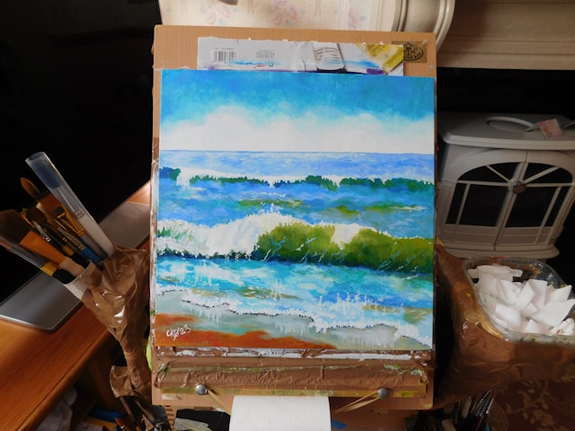
The Most Reproduced Oil Paintings in the World, Part 2

The_Dream_Picasso
Le Rêve by Pablo Picasso, 1932.

Here is the rest of the list of the most reproduced oil paintings according to Overstockart.com. You can read the first half here.

6. Le Rêve (The Dream) by Pablo Picasso
Le Rêve is a 1932 oil on canvas masterpiece by Pablo Picasso. As one of the most illustrious painters, art students have used Picasso’s paintings in training. Picasso used oversimplified lines, contrasting colors, and distorted depiction of his mistress. It was painted during the period when he was using women as subjects, different from his earlier works in the the Blue Period and Cubism period.

7. Luncheon of the Boating Party by Pierre August Renoir
Luncheon of the Boating Party portrays a group of Pierre Renoir’s friends relaxing and having lunch on a balcony at the Maison Fournaise restaurant in Chatou, France. Renoir effectively used color, texture, and shapes to convey space among the characters.  He used mostly warm colors, from red to gold, the colors primarily used during the Impressionist period.

8. The Scream by Edvard Munch
The Scream shows a somewhat neurotic, hairless figure who is shouting. Edvard Munch created four versions of this piece (in oils, pastels, and tempera).  Many interpretations have been given to this painting — the iconic figure is in turmoil, desperate, shocked, anxious, or frightened. The painter used explosive strokes, contrasting colors and lines. He used soft curves in reds and oranges to represent the sky, and strong, straight lines in black and brown paints for the bridge.

9. Red Canna by Georgia O’Keeffe
Red Canna is an artistic representation of a flower. Georgia O’Keeffe depicted natural sources using abstract patterns. The painting shows the enlarged petals of the flower, as if under a microscope. Colors used are mostly reds, yellows, and blues. O’Keeffe said flowers are small that nobody notices them and this painting shows how she sees a flower, and she painted the size bigger than reality.

10. Persistence of Memory by Salvador Dali
Persistence of Memory is a surrealist painting, showing images of soft, melting watches. The presence of ants in the orange watch represents death. Looking at the painting, it seems like an image from a dream. It is the best example of Salvador Dali’s theory of “softness” and “hardness.” Dali clarified that contrary to some interpretations that this piece was inspired by the Theory of Relativity, the painting was just a depiction of a Camembert cheese melting under the sun.

If you are a beginner in painting, you can try to copy any of these paintings so you can experiment on different techniques and color palettes.

Image source: http://www.pablopicasso.org

Top 10 Art Exhibits in the United States for 2013

For artists and art enthusiasts, finding great new inspirations from artworks from various artists is a must. For 2013, here’s a list of the best exhibits that made admiring art into new dimentions.

1. Angles, Demons, and Savages: Pollock, Ossorio, Dubuffet
An exhibition of work by American artists Jackson Pollock and Alfonso Ossorio, as well as French painter Jean Dubuffet held in Phillips Collection, Washington, DC last February 9- May 12, 2013. The exhibit displayed around 53 paintings and drawings that show a visual friendship enjoyed by all three artists.

exhibit1
IMAGE: Enamel and oil on canvas
The Metropolitan Museum of Art, New York

2. William H. Johnson: An American Modern

An exhibition of the work of modern American artist William Henry Johnson, the self-described “primitive and cultural painter” held in Georgia Museum of Art last February 16- May 12, 2013. The exhibit included some of the artist’s famous artworks such as Twenty landscapes, still-lifes and portraits including the iconic “Blind Singer” and “Aunt Alice.”

3. Chagall: Beyond Color
A look at the paintings, sculpture, ceramics and collage of the Russian-French artist, Marc Chagall held in Dallas Museum of Art last February 17th – May 26th, 2013. The exhibit also includes a display of costumes made by Chagall in 1942 for the production of the ballet “Aleko,” choreographed by Léonide Massine with music by Pyotr Ilyich Tchaikovsky.


exhibit3
IMAGE:
Marc Chagall, Double Portrait with Wine Glass (Double Portrait au Verre de Vin)1917-1918
Oil on canvas

4. Kehinde Wiley: The Memling Series
Displays a new series of paintings by the New York artist Kehinde Wiley, who is known for his knack for re-envisioning classical styles of portraiture held in Phoenix Art Museum, N. Central Avenue Phoenix, AZ last February 20th – June 23rd, 2013. The exhibit includes eight paintings based on the work of Hans Memling, the Flemish master painter of the Northern Renaissance.

5. Impressionism, Fashion, and Modernity
The exhibit displays survey of the fashion trends that appeared in the works of the Impressionists and their contemporaries held in The Metropolitan Museum of Art last February 26th – May 27th, 2013. Around eighty major figure paintings seen in conjunction with period costumes, accessories, fashion plates, photographs, and popular prints that also show the relationship between fashion and art at this time.

6. Frida Kahlo, Diego Rivera and Masterpieces of Modern Mexico
An exhibition of works collected by Jacque and Natasha Gelman, Eastern European ex-pats who became Mexican citizens in 1942 and subsequently acquired art by Diego Rivera, Frida Kahlo, Rufino Tamayo, David Alfaro and more. The exhibit is now being held in Nelson-Atkins Museum of Art started last May 25 all the way through August 18, 2013. There are more than 100 paintings, sculptures, photographs, and drawing in the exhibit.

7. Fernand Leger and the Modern City
Using Fernand Léger’s 1919 work, “The City,” as a jumping off point, the exhibit showcases the French artist’s array of paintings, all of which incorporate forms of cultural production central to modern cities, like graphic and advertising design, theater, film, and architecture. To be held in Philadelphia Museum of Art on October 2013 – January 2014. The exhibit will display over one hundred Leger works from collectors and institutions across Europe and the US.

8. Wayne Hollowell’s “Drama Queen”
This exhibit features a dazzling display of pop culture portraits just in time for NYC Pride held in Michael Mut Gallery, New York last June 26-30, 2013.

exhibit8

9. Enrico David
An exhibition of Italian-born artist, Enrico David, known for his figurative multimedia works that reveals a dark underworld of surreal, craft-informed creatures held in Hammer Museum last January 12th – May 5th, 2013. The collection included paper mummies, hand-crafted tapestries and cavernous paintings.

10. The Artist and the Poet
Planned to coincide with the institute’s “Picasso and Chicago” exhibition, the array of prints and drawings reveal the collaborative relationship between artists like Pablo Picasso, Robert Motherwell and David Hockney and poets such as Max Jacob, Rafael Alberti and Wallace Steves, respectively. Held in The Art Institute Chicago last February 1st – June 2nd, 2013. The collection includes “Skin with O’Hara Poem” (1963–65), a print by Jasper Johns that was inspired by the poet Frank O’Hara.

Source:Huffpost Arts & Culture http://www.huffingtonpost.com

The Most Reproduced Oil Paintings in the World, Part 1

Poppy_Fields_near_Argentuil_Monet
Poppies, Near Argenteuil, Claude Monet, 1873.

Art students can learn painting techniques and styles by copying famous paintings in art history. Copying trains your hand and eye coordination and lets you get a deeper appreciation of the arts. You can learn the different styles and painting techniques by studying these notable paintings. It inspires you to create something beautiful as well.

In 2010, OverstockArt.com, an online business that sells painting reproductions, revealed the top 10 list of most reproduced paintings. If you are thinking which painting to copy, check out this list for inspiration.

1. The Starry Night by Vincent van Gogh
The Starry Night is among Vincent van Gogh’s most celebrated works. The subject of the painting is the night scene in the village Saint-Rémy-de-Provence, southern France. It was painted during the time Van Gogh spent inside an asylum in the same village. The painting is filled with movements and contrasts, from the colors used to the quietness of the village vis a vis the swirling night sky.

2. Café Terrace at Night by Vincent van Gogh
Vincent van Gogh was fascinated with nocturnal motifs and Café Terrace at Night was no exception. He was known for his innovative use of lines, textures, and colors. You can see the contrast between the yellows and blues to black paint he used in this piece. The roughness of the cobblestone street is a direct contrast to the smoothness of the cafe.

3. The Kiss by Gustav Klimt
The Kiss is an oil and gold leaf on canvas. It depicts a couple embracing with elaborate robes and ornamentation. Gustav Klimt used the Art Nouveau style in this painting. The male figure is identified with squares and rectangles while the female figure has circles and soft lines. The couple is intimately entwined while the rest of their bodies dissolve in a shimmering flat pattern.

4. Poppy Fields near Argenteuil by Claude Monet
Claude Monet lived in Argenteuil, France from 1871-1878. The countryside became a great inspiration for Monet. The vast, bright landscapes around the region allowed Monet to experiment plein-air painting. In the painting, you’ll notice that he used blobs of paints to represent the poppies and trees, creating just an impression of the landscape.

5. The Mona Lisa by Leonardo da Vinci
One of the most famous paintings in history, The Mona Lisa has been reproduced and copied by many artists. Leonardo da Vinci used the technique called sfumato wherein he used subtle gradation of tone and color. This technique blurs and softens the contours of the outline, creating an atmospheric effect and the facial features seem real.

Image source: http://www.webexhibits.org

Where To Find Art Buyers?

Selling your art is no different from selling other items. All you need to do is to find the right people who want to buy them and the right places to display your art and make it look good, where art buyers tend to congregate, and places where you know the client can afford your asking prices. Here are some of the best places where you can find your buyers.

Galleries
Still, the best place to find a buyer for your artwork is in an art gallery. You can look around to find an art gallery exhibition and display your work. Find a good art gallery to represent you, and who can arrange an art show for you. Art buyers often show up at the opening just to see if there is anything that they like. There are always potential buyers who come to these exhibitions looking for good paintings.

"Ausschnitt (Kreutz)" by Gerhard Richter

Social Media and Art Websites

There are many social networks, online galleries, and other websites online to market art. There are by far too many to mention here, but the major ones are Facebook, Google+, Twitter, and many online gallery websites. Sign up and start advertising online. If you manage to sell many, you are not only making money, but are receiving free advertising! People will be talking about your art, or share it through the mail. Many will see your artworks, who would not have been able to before.

Art competions, Auction sale and Art Expos
Try to join as frequent as possible in competitions and art events. Even if you do not win, you and your artwork will get exposure. Whoever is on the judging panel will see it, be it gallery owners or curators. The more they have to judge your artworks the more they will be familiar with you and know how serious you are about your art career. Its usually best to show alongside other artists who work in the same style as you. That way, the art buyers that often buy from them, may purchase artworks from you.

300x2367

Neighbors, Family and Friends
Of course, the first people who have to see your artwork are the ones who are nearest to you. Show them what you are creating. Show them to your family members, friends and you neighbours. . Even if they do not buy artwork from you, they may tell others about your creations.

It’s best to never pressure someone into buying though. If they like it, or can afford it, they will most likely purchase from you without any convincing. Observe how art is sold in as many different circumstances as possible. Watch how people sell at all types of galleries, art shows, art fairs and other venues where art is for sale. See what sales techniques work to different kinds of buyers and take note which one doesn’t. Research on what sells best and why and learn everything you can from gallery owners and fellow artists about how they present, market, and sell art to clients.

Image source: www.forbes.com

Amazing Night Landscape Oil Paintings for Inspiration

If you’re stuck in a rut, without inspiration for a theme of your painting, why not look at these night landscapes to get your creative juices running. Many artists have used the night as motif in their works. The night sky evokes mystery, secrets, and coolness. Here are some famous examples:

The_Night_Watch_Rembrandt
The Night Watch (1642) by Rembrandt

1. The Night Watch (1642) by Rembrandt
The Night Watch is an oil on canvas created by Dutch painter Rembrandt van Rijn. It is one of the most famous paintings in the world, known for its gigantic size (11.91 ft × 14.34 ft), effective contrast of light and shade known as chiaroscuro, and perception of motion. The painting depicts a group of military men out to protect the city. Even though the painting involves many people, you are still directed to the three most important characters in the piece: the two men at the center, Captain Frans Banning Cocq (left) and his lieutenant, Willem van Ruytenburch (right); and the girl in the background. The impressive use of chiaroscuro allowed Rembrandt to create these focal points.

The_Third_of_may_1808-Goya
The Third of May 1808 (1814) by Francisco Goya

2. The Third of May 1808 (1814) by Francisco Goya
The Third of May 1808 depicts the battle between Spaniards and Napoleon’s armies at Medina del Rio Seco, Spain. The content, presentation, and emotion of the characters in the painting successfully represented the fear, suffering, and horrors of war.

starry-night
The Starry Night (1889) by Vinvent van Gogh

3. The Starry Night (1889) by Vincent van Gogh
The Starry Night is one of the most famous paintings of Vincent van Gogh. It portrays the view outside Van Gogh’s sanitarium room window in southern France. Paints in blues and blacks are prominent in the piece with touches of yellows and whites. It is displayed in the Museum of Modern Art in New York.

Nighthawks-Hopper
Nighthawks (1942) by Edward Hopper

4. Nighthawks (1942) by Edward Hopper
Nighthawks is a painting about people eating in a diner late at night. Edward Hopper revealed that the painting was inspired by “a restaurant on New York’s Greenwich Avenue where two streets meet.” Hopper tried to capture the effects of man-made lights (flourescent lights, lamp post) at night.

The_Empire_Of_Light-Magritte
The Empire of Light (c.1950) by René Magritte

5. The Empire of Light (circa 1950) by René Magritte
The Empire of Light has numerous versions and all depicts a street scene during night and day. Belgian surrealist artist René Magritte painted The Empire between 1950-1954. The pieces look like its early dawn or late in the afternoon, the time when the sun sets but it’s still not completely dark. You cannot really be sure whether its day or night because Magritte presented the illusion of night and day in these paintings.

Image source: http://www.wikipaintings.org/

Learn the Oil Painting Technique: Broken Color

Broken color was first used by Monet and the Impressionists in 19th century French painting, where color was applied in small dabs of paint compared to the traditional method of smoothly blending colors together. This method results in more of a “patchwork” effect, where the dabs render the facets of light on forms, and/or the planes of the forms’ volume, by means of color and value. Broken color has continued to be used in much modern and contemporary painting.

leonid-afremov-paintings-22

Impressionist painting characteristics include relatively small and thin, yet visible brush strokes or dabs, with emphasis on accurate depiction of light in its changing qualities. Illusion of movement is a crucial element of human perception and experience, wherein the image seems to move in different visual angles.
The length of brushstrokes can vary from painting to painting depending on your mood as a painter. You do not blend any of these brushstrokes. Each brushstroke is allowed to remain separate. Cleaning your brush frequently is one tip to allow a clean color with thick paint. The tendency is that the viewer will “visually mix” these brushstrokes to view a whole image.

Using this method, small quantities of different colour are placed close together. When viewed from a distance, the eye interprets these mixed colours in the same way it would if they were physically combined on the palette before applied to the canvas. The surface area a certain colour occupies determines its intensity.
Another technique is to dip perhaps one corner of the flat brush into one color pigment on the palette then the other corner holds paint of a different color, and then is applied to the surface. There are variations of how to apply the effect but the idea is that the eye blends this and sees an impression of the color suggested.

leonid-afremov-paintings-7

The simplest way to create a broken color is to add to any hue a certain amount of its complementary, or a bit of one of the hues lying to the right or to the left of its complementary. This will allow the viewer to mix the colors on their own.

The term broken color may take on a clearer meaning if, for “broken,” we substitute the word damaged or diminished. Strictly speaking, a broken color is one that emerges from a tug of war with other color particles or semi-chromes in its body. The only flaw in the broken colour method is that you won’t appreciate the painting at a close distance. The portrait looks a lot different when viewed from a few metres than a few centimetres.

Image source: Colourful paintings by Leonid Afremov www.demilked.com

The Beauty and Popularity of Photorealism

American author and art dealer Louis K. Meisel coined the term “photorealism” in 1969. It refers to a genre of painting based on using photographs as basis for a realistic and photographic art work. This movement started in the late 1960s and early 1970s. During that time, artists captured images of their subjects to gather visual information and used these photos in their paintings.

To give a definite definition for an artist to be considered as a photorealist, Meisel released these 5 points:

  1. The Photo-Realist uses the camera and photograph to gather information.
  2. The Photo-Realist uses a mechanical or semimechanical means to transfer the information to the canvas.
  3. The Photo-Realist must have the technical ability to make the finished work appear photographic.
  4. The artist must have exhibited work as a Photo-Realist by 1972 to be considered one of the central Photo-Realists.
  5. The artist must have devoted at least five years to the development and exhibition of Photo-Realist work.
crayola_flack
Crayola by Audrey Flack, 1972-73.

The cool thing about photorealism is that you can mistaken a photorealistic painting as the actual photo. You’ll be surprised how a painting can look fantastically as the real thing. Many artists who are called photorealists have experimented and became popular in this painting style such as Charles Bell, Audrey Flack, Tom Blackwell, and Raplpf Goings. They use ordinary, mundane objects as their subjects such as food, flowers, beaches, diners, etc.

Before creating a photorealistic painting, artists create several studies of the subject to learn its composition, colors, shadows, form, and perspective, much like a mock-ups. From these studies, they can try to tell which element or area could become a problem when painted in large-scale and they try to find a solution. These artists gave attention to the minutest details of the subject and they try to portray subjects as accurately as possible, a total opposite of the Abstract Expressionist movement.

Between_Two_Places-Zener
Between Two Places by Eric Zener

You may ask, why create a photorealistic painting that take days or even months to finish when you can just take the subject’s picture? The answer: technical virtuosity and enigma. It’s fascinating to look at these paintings because you’ll think they’re “real” but they’re not, because they’re paintings.

Many contemporary photorealists have created art works using water (swimming pools, bathrooms, water splashes), reflections (mirrors, glasses, bottles), food from freshly cooked to packaged ones as subjects. The colors are vibrant, vivid, and intense, it looks like you can almost touch the subject of the painting. Amazing, right?

Image sources:
http://www.audreyflack.com
http://www.escapeintolife.com

Learn the Oil Painting Technique: Wet into Wet

Also known as Alla Prima (Italian for first attempt), wet-on-wet means you simply paint over wet paint. The goal in this technique is to finish the whole painting before the first paint dries therefore working fast is the key. Here are some things that you need to know about wet-on-wet painting.

morris hinson1

• You start the wet-on-wet technique using thinned oil paint for drawing. Then you place spots of colors all over the painting to fill it in because the sketch usually dissolved or over-painted as the painting progresses. The painting can be adjusted slightly with glazes and highlights after it dries.

• Blending colors is easy with wet on wet technique. You can directly place one color onto your canvas, and then add other colors and blend with brush or knife to you desired shade. But you have to make sure that you mix colors rapidly and with clear understanding of color theory and keeping in mind the form that you’re trying paint. Expertise with brushwork is very important to do the trick.

• The beauty of wet-on-wet technique is that it sustains the fresh and spontaneous inspiration that come as you paint. For me it is the most intuitive way to paint. Creating a portrait with the technique will require expertise in mixing colors to match your subject.

• It may require few layers of paint to complete the painting, in which case it is easy to overfix the paints, which can look labored and weak. This is the stage where many beginners give up, but if you press on, you can master wet-on-wet technique and create works with the amazing freshness and spontaneity that only wet on wet can provide.

morris hinson2

• When working wet-on-wet pull the brush along its length with the handle close to the surface. You get two strokes with a flat bristle brush, one side then the other, look at the brush for any paint it picked up and wipe it. Think of the brush hairs as if they were the fingers on your hand stroking the surface. This method allows wet paint to go over another (wet) color with clean results.

Using this technique have its advantages. One is you don’t need fine drawing skills. Blending is also quite easy in this technique so you don’t need extensive blending of colors. Lastly, your paintings can be completed quickly (about 2 hours to 2 days only) because you have to make sure that you’re working on wet paint.

This technique is quite advanced and requires a bit of painting experience. Using the Wet-on-Wet method, a dedicated practice and experimentation are all that is necessary to achieve masterpieces that you never imagined you can possibly do.

Paintings by Morris Hinson http://www.thumbartsguild.com/artist/mhinson.html

Acrylic Artists Who Made Their Mark in History

Campbells_Soup_Cans_Warhol
Campbell’s Soup Cans, 1962

Many artists use acrylics in painting due to its fast-drying qualities and versatility. Unlike oil paints which take decades to fully dry, an acrylic painting can dry in just hours. You can also use different painting styles when using acrylics and you can use it on canvas, paper, wood, glass, or even stone.

Here are the famous artists who used acrylics in their art works:

1. Andy Warhol (August 6, 1928 – February 22, 1987). Andy Warhol was a celebrated American artist and was considered as one of the leading figures in Pop Art. He was the one who started the use of everyday items such as soup cans, soft drink bottles, and dollar bills as subjects in his paintings which were then displayed in museums. Aside from using mundane objects, he was fascinated in the entertainment industry and used famous celebrities and even political figures as subjects. He created portraits of Marilyn Monroe, Elvis Presley, and Jackie Kennedy.

2. Kenneth Noland (April 10, 1924 – January 5, 2010). Kenneth Noland was an American abstract painter. He was known for his geometrical themes called Chevrons and Stripes and circular motifs which are called Target paintings. Noland was known as one of the leading figures in the Color Field painting style in the US. In the 1950s, he was able to meet influential people in the art scene such as abstract expressionists Helen Frankenthaler and Morris Louis. They greatly affected the artistic direction of his career. He started using Frankenthaler’s technique in stain painting wherein he used a thinned acrylic paint on unprimed canvas. These three painters led the formation of the Color Field painting style.

3. Robert Motherwell (January 24, 1915 – July 16, 1991). Robert Motherwell was an American abstract painter. In the 1960s, he used acrylics in painting large-scale canvases. Primarily using oils, he switched to acrylics because of its quick drying time. The Elegy of the Spanish Republic is considered as one of his most important works. It is a series of abstract paintings using black and white paint in bold movements and strokes.

4. David Hockney (born July 9, 1937). David Hockney is an English painter and draftsmen, and a founding member of the British Pop Art movement in the 1960s. He is one of the most famous British  artists. His visit in California inspired him to paint swimming pools and the urban landscape using acrylics. During that time, he developed his own style of painting called naturalistic-realistic painting. One of his famous works includes The California Collector (1964) which depicts a swimming pool in LA.

5. Roy Lichtenstein (October 27, 1923 – September 29, 1997). Roy Lichtenstein was an American pop artist who used comic strips and advertisements as inspirations in his art works. He was famous for creating bright and graphic images which parodied pop culture. In one of his most significant works, Drowning Girl, he used both oil and acrylic (Magna) paints and the piece was considered as a “masterpiece of melodrama.”

Image source: http://www.moma.org

Learn the Oil Painting Technique: Blending

Color blending is a technique wherein two colors are combined to create another color. Each color has a separate blend factor that determines how much of each color is combined into the final product. There are different ways to blend colors and different ways with different medium. Today, I will share some techniques in color blending using oil paints.

blue_blend

How to start?
Once you’ve decided what colors you want to blend to create an effect, you might want to blend small amounts of each and check if it’s the color you’re looking for then you can make necessary adjustments. Move the brush in a way from one color into the other and back or in a zigzag motion. Wipe off any paint from your brush before you start blending or better yet, start with a clean, dry brush so you won’t add any extra paint that is not part of your color scheme.

Indigo sunset original oil painting, seascape  by Gina De Gorna
Indigo sunset original oil painting, seascape
by Gina De Gorna
Image source: http://sunsetartonline.com

How to blend on canvas?
You don’t want the colors mix equally so stroking your brush sideways at least initially or else you’ll have strips of concentrated colors in your blended color. Remember to keep your strokes short and picking different percentages of blending. Keep repeating until it blends. As your tip gets thinner you get a smoother result, and once is smooth enough you can use blur or smudge tool to finish the job in case you want perfect gradients. If you think your blended color is not blending well or it’s too concentrated on canvas, all you need to do is to pick up a little fresh paint in the color that’s at risk of being lost then work from the outside or the darker shade until its blended. You can take your time blending with oil paints because they dry slowly unlike with acrylic paints.

flat-brushWhat type of brush and brushstroke is best to use in blending?
Create a transition between the first two shades using a crosshatch stroke. Flat brushes tend to work best for blending. Smooth the blend by using parallel strokes along the transition you just created. The parallel strokes should be perpendicular to the lighter shades. Use a clean brush to blend the next shade, and repeat the technique using first crosshatched strokes followed by parallel stokes. A clean brush should always be used when working with a new shade, even if the actual color is the same.