Tagged: artist

How Artists Can Find Clients for Commission Projects

Photo by Ahmed Raza Kz on Unsplash

In the art industry, securing commission projects stands as an endeavor for artists aiming to sustain their craft and build a thriving career. Yet, in a landscape saturated with talent, navigating the path to finding clients can be challenging. However, with strategic approaches and a proactive mindset, artists can effectively connect with potential clients and secure commission projects.

  • Cultivate an online presence. Establishing a professional website or portfolio on online platforms can showcase past work, artistic style, and contact information. Social media also provide additional avenues for artists to share their creations, engage with a broader audience, and attract potential clients through visual storytelling and networking.
  • Online artist communities. Actively participating in online artist communities and forums can expand an artist’s reach and visibility. DeviantArt or Reddit offer spaces for artists to share their work, receive feedback, and connect with like-minded individuals. Engaging with these communities not only fosters a sense of belonging but also opens doors to collaboration opportunities and client referrals.
Photo by Michał Parzuchowski on Unsplash
  • Local art shows and fairs. These events provide valuable exposure and networking opportunities within the artist’s community. Artists can showcase their work directly to potential clients, art enthusiasts, and industry professionals. Building relationships with local businesses, galleries, and art organizations can also lead to commission opportunities through referrals and partnerships.
  • Word-of-mouth marketing. This strategy is free! Satisfied clients can become powerful advocates for an artist’s work, spreading recommendations and referrals to their networks. Remember that your relationship with a client doesn’t end upon sale. You should provide exceptional customer service, maintain open communication, and deliver high-quality work to cultivate positive relationships and generate repeat business and referrals.
  • Seek out potential clients. Look for businesses, organizations, and individuals who may require commissioned artwork aligned with your style and expertise. Write personalized pitches and proposals that demonstrate an understanding of the potential client’s needs and vision to significantly increase the likelihood of securing commission projects.

Finding clients for commission projects may present challenges, but maintaining a dedication to your craft and adopting these approaches can help you establish yourself as sought-after painters and cultivate a thriving career in the competitive world of arts.

Oil Painting Terms: Part Three

Oil-Painting-Workspace-1

Oiling out – The application of an oil medium to a painting that has sunk (become dull) or lost its oil to the layer underneath. Artist’s painting medium should be rubbed sparingly into any sunken areas with a clean cloth, wiping off any residue, allowing to dry for a few days and repeating as necessary until an even sheen is obtained throughout.
Optical Colour Mixture – The tendency of the eyes to blend patches of individual colours placed near one another so as to perceive a different, combined colour. Also, any art style that exploits this tendency, especially the pointillism of Georges Seurat.
Organic – An image that shows a relationship to nature as opposed to man-made images. Any shape that resembles a naturally occurring form or that suggests a natural growing or expanding process.
Painted Edges – Not all canvasses are framed. Instead, some are intended to be hung without frames. If this is the artist’s intention, the artist will often paint over the edges of the canvas onto the sides. This not only allows the painting to be hung unframed, but also creates the interesting effect of extending the painting into three dimensions.
Pastel – A colored crayon that consists of pigment mixed with just enough of an aqueous binder to hold it together; a work of art produced by pastel crayons; the technique itself. Pastels vary according to the volume of chalk contained and the deepest in tone are pure pigment. Pastel is the simplest and purest method of painting, since pure colour is used without a fluid medium and the crayons are applied directly to the pastel paper or card.
Pentimento – A condition of old paintings where lead-containing pigments have become more transparent over time, revealing earlier layers.
Perspective – The representation of three-dimensional objects on a flat surface so as to produce the same impression of distance and relative size as that received by the human eye. In one-point linear perspective, developed during the fifteenth century, all parallel lines in a given visual field converge at a single vanishing point on the horizon. In aerial or atmospheric perspective, the relative distance of objects is indicated by gradations of tone and color and by variations in the clarity of outlines.
Pictorial Space – The illusory space in a painting or other work of two-dimensional art that seems to recede backward into depth from the picture plane, giving the illusion of distance.

Oil-paints
Picture Plane – An imaginary flat surface that is assumed to be identical to the surface of a painting. Forms in a painting meant to be perceived in deep three-dimensional space are said to be “behind” the picture plane. The picture plane is commonly associated with the foreground of a painting.
Pigment – Dry coloring matter, usually an insoluble powder to be mixed with a liquid to produce paint.
Pochoir – A stencil and stencil-brush process for making muticoloured prints, and for tinting black-and-white prints, and for coloring reproductions and book illustrations, especially fine and limited editions. Pochoir, which is the French word for stencil, is sometimes called hand-coloring or hand-illustration. Pochoir, as distinguished from ordinary stencil work, is a highly refined technique, skillfully executed in a specialized workshop.
Positive Space – The space in a painting occupied by the object depicted (not the spaces in-between objects).
Provenance – The record of ownership for a work of art, ideally from the time it left the artists studio to its present location. French for source or origin.
Replica – An exact copy of an original work of art that is made by, or under the supervision of, the original artist.
Repoussoire – From the French verb meaning to push back. A means of achieving perspective or spacial contrasts by the use of illusionistic devices such as the placement of a large figure or object i the immediate foreground of a painting to increase the illusion of depth in the rest of the picture.
Reproduction – A mechanically produced copy of an original work of art (as distinct from replicas which are one-offs).
Semblance – A picture consisting of a graphic image of a person or thing.
Shading – Showing change from light to dark or dark to light in a picture by darkening areas that would be shadowed and leaving other areas light. Shading is often used to produce illusions of dimension and depth.
Signature – An artists name physically signed (or carved) on a work of art usually providing evidence that the work is entirely by the hand of the artist who signs the work. The Signing of prints is usually done using a soft base pencil in order that it’s dark, clearly visible and does not fade over time.
Silhouette – The outer shape of an object. An outline, often filled in with color.
Simultaneous Contrast – The tendency of complementary colors to seem brighter and more intense when placed side by side.
Study – A detailed drawing or painting made of one or more parts of a final composition, but not the whole work.
Style – A characteristic or a number of characteristics that can be identified as being embodied in a work of art. Typically associated with a specific artist, group of artists, culture, or a specific artists work during a particular time period. “In the style of …. ” means that the work resembles a particular artists style but is not actually created by that artist. “In the studio of …. ” means that the work was created by a student, apprentice or colleague of a particular artist whose style it resembles and possibly supervised by that artist.

629px-2011_1201---Oil-Paint_1
Support – The surface, or material, on which an artist creates two-dimensional art. Can be canvas, paper, cardboard or wood panel. The surface often has to be treated before the paint is applied so as to neutralize any natural acidities and protect the work from discolouration or deterioration.
Tempera – Medium, typically egg yolk which was used in the Renaissance prior to the advent of oil and has benefited from a recent revival.
Tonality – The overall color effect in terms of hue and value. Often one dominating hue is employed in various shades and values.
Triptych – A painting or carving consisting of three panels.
Underpainting – The traditional stage in oil painting of using a monochrome or dead color as a base for composition. Also known as laying in.
Vanishing Point – In linear perspective, the point on the horizon line where parallel lines appear to converge.
Vignette – A small illustrative sketch or painting that appears to float suspended on a surface.
Wash – Used in watercolor painting, brush drawing, and occasionally in oil painting and sculpture to describe a broad thin layer of diluted pigment, ink, glaze or patina. Also refers to a drawing made in this technique.
Yellowing – This effect on oil paintings is usually caused by one of three reasons: excessive use of linseed oil medium; applying any of the varnishes that are prone to yellow with age; or most often – an accumulation of dirt embedded into the varnish.

Image source: www.wikihow.com

Oil Painting Terms: Part Two

Diptych – A painting or carving consisting of two panels.
Enamel – When painting, used upon a ground of metal, porcelain, the colours afterward being fixed by fire.
Fine Art – Generally used to describe art that has been created purely as an aesthetic expression to be enjoyed for its own sake (as opposed to applied arts or decorative arts or design). The viewer must first search for the intent of the artist in order to fully appreciate, identify or relate to the artwork.
Fixative – A solution, usually of shellac and alcohol, sprayed onto drawings of pencil, chalk and pastels, to prevent their smudging or crumbling off the support.

fels-naptha-clean-upForeshortening – The diminishing of certain dimensions of an object or figure in order to depict it in a correct spatial relationship. In realistic depiction, foreshortening is necessary because although lines and planes that are perpendicular to the observer’s line of vision (central visual ray), and the extremities of which are equidistant from the eye, will be seen at their full size, when they are revolved away from the observer they will seem increasingly shorter. Thus for example, a figure’s arm outstretched toward the observer must be foreshortened–the dimension of lines, contours and angles adjusted–in order that it not appear hugely out of proportion. The term foreshortening is applied to the depiction of a single object, figure or part of an object or figure, whereas the term perspective refers to the depiction of an entire scene.

Fresco – The art of painting on freshly spread plaster before it dries, or in any manner.
Gesso – A white ground material for preparing rigid supports for painting. made of a mixture of chalk, white pigment, and glue. Same name applied to acrylic bound chalk and pigment used on flexible supports as well as rigid.
Glaze – A very thin, transparent coloured paint or glossy finish applied over a previously painted surface to alter the appearance and colour of the surface.
Gold leaf – Very thin leaves of real gold that are burnished onto an object such as a wooden frame that has been coated with several layers of other material in preparation. The process is expensive because of the use of precious metal.
Gouache – A watercolour executed by using opaque watercolours mainly for illustrations.
Grisaille – Chiaroscuro painting in shades of gray imitating the effect of relief.
Gum Arabic – The binder used in watercolor and which is made from the gum of the Acacia tree (in the past commonly associated with Arabia, in recent decades also found in the West).
Harmony – The unity of all the visual elements of a composition achieved by repetition of the same characteristics.
Hatching – A technique of modeling, indicating tone and suggesting light and shade in drawing or tempera painting, using closely set parallel lines.
Iconography – Loosely, the “story” depicted in a work of art; people, places, events, and other images in a work, as well as the symbolism and conventions attached to those images by a particular religion or culture.
Idiom – The style of a particular artist, school or movement.
Illustration – A general term used for a drawing or an original work of art.
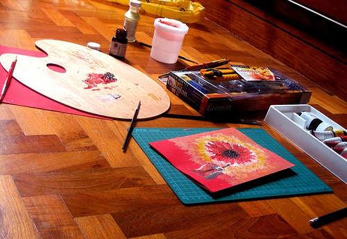
Knife – A painting knife may be utilized for the application of paint, whereas a palette knife is primarily utilized for mixing and blending the paint on the palette.
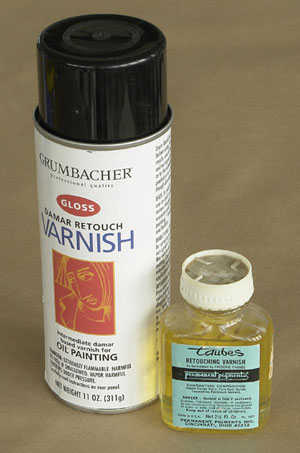
Lacquer – A varnish consisting of a solution of shella in alcohol, often used for varnishing metals.retouch-
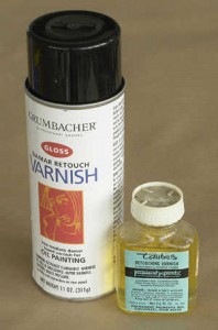
Licensing – The act of selling a license to reproduce an artist’s work for a specific purpose. There are licensing agents who specialize in negotiating deals with makers of porcelain, giftware, stationery etc. Artists should be aware of the difference between selling a license and selling their copyright in a work.
Linear Perspective – A method of depicting three-dimensional depth on a flat or two-dimensional surface. Linear perspective has two main precepts: 1. Forms that are meant to be perceived as far away from the viewer are made smaller than those meant to be seen as close 2. Parallel lines receding into the distance converge at a point on the horizon line known as the vanishing point.
Mannerism – A deliberate simulation or exaggerated display.
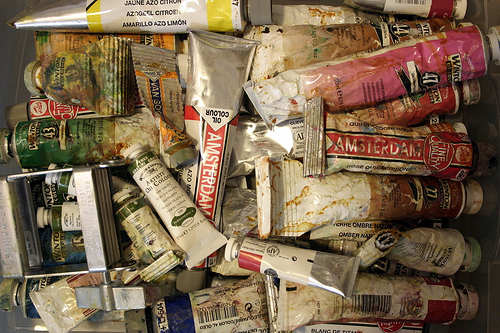
Medium – Used to describe either the material used to create a work of art (such as oil, acrylic, pencil, water-colour, charcoal, stone, cloth or other material); the liquid with which pigment or an existing oil paint is mixed to create or modify the paint, or an expressive art form.
Mixed Media – Used to describe art that uses more than one medium (such as a work that combines paint, natural materials and man-made materials) to create a single work of art.
Monochrome – Painting done in a range of tints and tones of a single colour.
Montage (Collage) – An artwork comprising portions of various existing images such as photographs or prints and arranged so that they join, overlap or blend together to create a new image or artwork in its own right.
Mural – A painting that is applied to a wall surface.
Neutral – Having no hue – black, white, or gray; sometimes a tannish colour achieved by mixing two complementary colours.
Numbered – A numbered print is designed to show the limit or size of a print edition. The number is generally placed over the size of the edition. For example 12/500 indicates that the print is number twelve out of an edition of 500.

…to be continued

Image source: www.guidetooilpainting.com

Oil Painting Terms: Part One

Oil Painting Terms
Oil painting has several words that ought to be learned prior to obtaining a brush. Many oil painting terms origin from Latin roots so mispronunciations are very common. Please bear in mind that there may be some variation between the various professionals, organizations and especially between different languages following translation to English. Here are some of the common terms that a new artist should be familiar with.

Oil-painting-essential-materials-techniques-Good-Paints

Abstraction – The process of leaving out of consideration one or more properties of a complex object so as to attend to others.
Acrylic – A type of rapid drying and versatile synthetic paint that is an especially popular with artists working today. The term is also used as a generic term for any synthetic paint medium. Acrylics have good adhesive and elastic properties, they resist ultraviolet light and chemical degradation and are easy to remove with mineral spirits. They are often used in the restoration of damaged oil paintings.
Adumbration – A sketchy, imperfect or faint representation.
Altarpiece – A painted or carved screen placed above and behind an altar or communion table.
Alkyd – Synthetic resin used in paints and mediums to work as a binder that encapsulates the pigment and speeds the drying time.
Alla Prima – Technique in which the final surface of a painting is completed in one sitting, without underpainting. Italian for “at the first”.
Analogous Colours – Colours that are closely related, or near each other on the colour spectrum. Especially those in which we can see common hues.
Applied Art – As distinct from fine art, refers to the application of decoration to useful objects (such as ceramics, furniture, jewelry, etc.)
Aquatint – A method of etching that imitates the broad washes of a watercolour.
Artists’ Agent – A third party who handles the business and promotional aspects of an artist’s career. Many artists’ agents are also gallery owners. Sales agents sell a completed product, whereas artists’ agents tend to also negotiate licensing and publishing deals, organize exhibitions, handle PR and promotion and have some influence on the direction in which an artist’s career develops.
Batik – A painting or design that is applied to cotton using wax and dye. It often comes from the Far East or Africa. It is important to identify the correct way round for the image since the back is very similar to the front. Before stretching, batik should generally be placed between two sheets of brown paper or tissue and ironed; the heat will release any excess wax which will be absorbed by the paper. Batiks do not normally require squaring, as the weave is too close for this to be a problem.
Binder – The ingredient (such as oil, acrylic, egg tempera or gum arabic) in paints that causes the particles of pigment to adhere to one another and to a support.
Brushwork – The characteristic way an artist applies (brushes) paint onto a support producing an individualistic texture as well as aesthetic appeal and value. One of any artists most powerful attributes.

how-to-oil-painting-lessons-colours_pigments
Canvas – Closely woven cloth usually of cotton or linen that is used as a support (surface) for paintings.
Catalogue – A list of works of art often associated with an exhibition or auction that provides information on the works themselves, the artist, the materials and provenance.
Certificate of Authenticity – Certifies the authenticity of an individual piece in an edition and can also state the current market value.
Charcoal – Pure carbon prepared from vegetable or animal substances. Finely prepared charcoal in small sticks used as a drawing implement.
Chiaroscuro – In drawing, painting, and the graphic arts, chiaroscuro (ke-ära-skooro) refers to the rendering of forms through a balanced contrast between light and dark areas. The technique that was introduced during the Renaissance, is effective in creating an illusion of depth and space around the principal figures in a composition. Leonardo Da Vinci and Rembrandt were painters who excelled in the use of this technique.
Commission – To order an original, usually customized work of art from the artist.
Consignment Note – Signed agreements between artists and galleries to confirm that a gallery has taken possession of a painting, but that it the artist’s property until paid for in full. A consignment note represents proof of ownership in the event of an insurance claim, so it should always make clear that the work is insured the gallery while in its possession, whether in transit, at a fair, at a client’s house etc.
Copperplate – An engraving consisting of a smooth plate of copper that has been etched or engraved.
Copyright – The artist retains the copyright in a work regardless of whether the original has been sold. Copyright is separate from the painting itself, and the artist has the right to sell it. Legally, transfer of copyright has to be in writing. Within the EU copyright extends for 70 years after the artist’s death.
Crosshatching – Shading consisting of multiple crossing lines, typically usually used in pencil and ink drawings.

…to be continued

Image source: www.webartacademy.com

Ways to Create Texture to your Arwork

Putting texture in your artwork is a great way of adding a bit more life and character to an otherwise flat area. Brush strokes can create texture but there are other materials that you can use such as an old credit card or a cardboard or alsost anything that you can apply your paint with. The addition of some texture into a painting gives it a whole new dimension. Adding some highly textured areas against some very flat areas gives the painting wonderful contrast. Here are some tricks that you can use to create different textures to your artwork.

textured1

Use some binder medium such as Impasto gel. Glue down the appropriate literature and add three or four good, solid coats of impasto gel, and a glaze or wash or two. Paint over the top of that with an image that is relevant to the text beneath, and allow the text to show through in places. The effect is a three-dimensional aspect to the surface.
Lay down multiple layers of paint. The different layers create a tactile effect on the painting by making its surface less even and smooth. Paint with different paint thicknesses not only by varying the quality and type of paint, but also with how much paint you lay onto the canvas.
Scoop on some modelling compound or something similar material, and create shapes or objects into the surface. This will create lots of wonderful texture.
Stencils are also a great idea. For example, lace is laid on the surface then pulled off after a healthy layer of texture medium of some description, is a lovely experiment. Try laying some clear impasto gel over a finished piece using lace or some patterned material. When it is dry, drag a dry brush over the top, and that pattern will be revealed. Some great patterns can reveal themselves through some very odd household objects.

textured2
Use some shading and contrasting colors to create the impression of texture or to exaggerate an existing texture.
Spattering and stippling techniques can also create a very strong impression of texture because of the uneven layers of paint.

Other mediums & additives like impasto gel & modelling compound have texture and body already built in. A swipe with a palette knife or brush works wonders. These are just some of the ways we can create textured art. Use your imagination. Don’t be afraid to experiment. The range of textured art you can create is limitless.

Image source: www.etsy.com

How to Photograph Your Artwork for Online Display

Online art galleries and portfolios are the thing of today in terms of getting the word out about your art. Showcasing your artwork online needs to approximate the real thing and having good quality images of your artwork is a must. As an artist, you also need to keep visual records of your work—and whether you plan on selling your art right away or keeping it for years, you should always have up-to-date images ready to share.

Position your artwork almost perfectly upright
Put your artwork against a wall where it can stand on its own. It is not recommended that you lay your painting on the floor because it will be difficult for you to take a steady shot and you’ll block your light source that will create a shadow on your picture. When you take the photo, remember to tilt the camera slightly down to match the angle that the artwork is leaning – this will help minimize distortion of the original image.

photographing-artwork

Make sure that you have a sufficient, indirect natural light
Bring your artwork and your camera to a spot that’s full of bright light. Natural light is best. If the sun is too bright directly, bring your piece to a slightly shady area that’s still quite bright. If you’re forced to use artificial lights, get them as bright as possible, and reflect the light off of a white wall, poster board or another light surface to avoid over exposed parts in your photo. Look out for shadows, as well. If you use a flash, try taping a single sheet of toilet paper over it so it’s not so harsh.

Take a picture of your artwork
When you’re taking your photo, look at it directly from the front, so that the edges of the piece are parallel with the edges of the viewfinder. This keeps everything correctly proportioned.
Use a tripod so you won’t have to worry about hand shake or instability, and you can take time to frame your shot perfectly. If you don’t have a tripod, you can use anything that can hold your camera and your hands in place like a table or a box.

Avoid too much post processing
I f you think that your photo needs editing, then, you may do so. You may bring them up in Photoshop or whichever photo-editing software you use. You can remove some imperfections like cropping out the background and adjusting the contrast to approximate the real image. Do not overdo your editing. Remember that you want to post an image of your actual artwork not an edited version of it.

Image source: www.adcfineart.com

How To Fix Damaged Watercolour Paintings

Every type of damage in a watercolor painting has different procedures in order to clean and restore them. These procedures cannot reverse color fading but it can help prevent and stop further fading. Here are some tips that you can do for each type of damage.

how-to-fix-mistakes-in-watercolor1

Water Damage
• Gently remove the painting from the frame and separate the watercolor from the glass frame immediately after it has become saturated. Mold also begins to form after saturation. Don’t leave the image in place pressed against the glass because the image will be bonded permanently to the glass.
• Lay the watercolor on a flat, dry surface. Leave the artwork untouched until completely dry. Lay the artwork on a towel, blanket or on dry grass in the yard.
• Mist the front and back of the watercolor with a light coating of spray Lysol. Do not substitute with a chemical that contains bleach. The damage incurred from the bleach is irreversible. Wait for the mold to dry out and become dormant. You will notice that the mold will become powdery.
• Brush the mold off of the watercolor lightly with a clean, dry, soft-bristled paint brush.
• Put the painting back into the frame.

Dirt and Debris
• Break a loaf of bread in half. Grab a handful of the white inner portion of the bread. Roll the dough into a ball.
• Scrub the dough gently against the watercolor painting.
• Replace the dough as the piece you are working with gets dirty.
• Brush the bread crumbs off of the watercolor using a clean, dry, soft-bristled paint brush. Make sure that all bread crumbs have been removed from the painting.

Fade Prevention
• Instead of using an ordinary glass, use a UV3 coated Plexiglas. This will reflect the UV rays that cause the color to fade.
• Move any watercolor artworks away from direct sunlight. Artwork with the UV3 Plexiglas will not prevent all UV rays from damaging the color in the painting. Direct sunlight can harm the color and raise the temperature surrounding the painting that can fade the colors.
• Avoid hanging watercolor paintings where the temperature of the artwork would rise above 70 degrees Fahrenheit. Avoid hanging on outside walls that are not properly insulated, over fireplaces or near furnace grates and windows with direct sunlight.
• Replace all florescent lighting with incandescent light bulbs. Do not use direct lighting of any type on a watercolor.

Image source: www.paintingdemos.com

Tips for Watercolor Painters: Brush Skills Part Two

painterlyPainterly Strokes
Dab an old #12 Serie 7 Winsor & Newton round red sable on a paint color and start by laying the full brush on the paper and lifting away cleanly. Try more short dabbing strokes across your paper. Rinse your brush and change colors. Keep your brush strokes uniform in width as you start to overlap strokes to develop shapes. Play with different groupings of brush strokes across your paper. Use as many color as you please. Continue laying down similar brush strokes trying different angles of attack. Allow your wet brush strokes to intermingle as you progress.

stabThe Stab
Start by dipping your brush into a color you want and gently poke or stab your brush into the paper. The effect that you want to see after doing this is to see a fanning pattern of the hairs as you push it into the paper. Continue doing this on your paper, adding some twist or spin to your stroke by rolling your brush in your fingers as you paint. Experiment with angles of attack to find the best spreading point for the brush you are using. Consciously try to shape the hairs as you press a stroke into the paper. Give it a little wiggle while the brush hairs rest on the paper to make them align. Rinse and switch colors and/or brushes. Continue to practice spreading and twisting your brush, building texture across the paper. Look for organic shapes and textures as you allow your strokes and colors to overlap and blend. This is another example of a what is considered a painterly stroke.

cutCutting Edges
“Cutting an edge” is a sign painter’s term for pulling a clean line of paint with your brush. A clean line being a line that is smooth and flowing with no irregularities. Consider each shape before you start to paint. You may lightly doodle the shapes first before painting. A round #8 Grumbacher Watercolor Classic red sable brush can be used in larger shapes a round #4 Kolonok 1001 Series Kolinsky sable for smaller shapes. If your brush is too full to get a proper point, touch it on a sponge, tissue, or towel to remove excess paint before you start. While you have one color in your brush try painting all the different shapes across the page in that one color. Rinse your brush out, switch colors, and repeat. For sharp corners use the very tip of your brush and start the brush stroke at the corner point of the shape. For circular shapes, start your curving brush stroke inside the edge of the shape and pull the stroke into position before continuing the stroke. Switch to a smaller brush and try some mini shapes.

Tips for Watercolor Painters: Brush Skills Part One

Practice makes perfect. Every skill that we learn is perfected through constant practice until we perfect them and becomes a second nature to us. Aside from being a talent, painting is a skill that needs to be honed and mastered. Other more experienced watercolor artists have developed different techniques that created their masterpieces that we can also use and here are some of them.

band of colorsBands of Color
Dip your watercolor brush into a color until loaded and start to paint a continuous wavy pattern across the paper. Keep the width of the strokes equal as much as possible. Add more paint to your brush as needed and continue where you left off until you reach the end of the paper. Rinse your brush and dip it in another color. Make another wavy line right next to the first one but make sure not to let the washes touch. Leave white paper between each stroke. Continue doing this until you fill the whole paper.

thick and thinThick and Thin
Choose a color or a combination of colors. Dip your brush into the paint and make sure it’s not too wet. Start a fine line using the tip of the brush first then start putting pressure on the brush to make a thicker stroke then lessen the pressure until the line thins out again. Do this without lifting the brush off the paper. Reload your paint brush as needed. Rinse your brush and use other colors to make more lines using the same technique until you fill the paper. You can try to thicken your stroke where the adjacent line is thin, but in particluar, avoid touching the other washes with the new colors you lay down. Being able to instinctively thicken or thin a brush stroke on command while you are painting, and have it go where you want it, is a good preparation for your future masterpieces.

flickWrist Flick
The Wrist Flick is easily done with a decent round red sable or a rigger-style brush. Put paint in you brush and position the tip of the brush pointing towards you. Push the brush tip upward with a flicking motion creating a feathery point at the last part of the stroke. One technique that you can use is you can rest your brush hand on top of my other hand for stability and control of detailed flick strokes. Practice several times in each color you have. Vary the thickness of the strokes as you try to imitate grasses, branches, or even feathers.

There are more of these techniques. Watch out for par two!

Watercolor Paintings by Vincent Van Gogh

Scheveningen Woman Etten: November-December, 1881 (Amsterdam, Van Gogh Museum)
Scheveningen Woman
Etten: November-December, 1881
(Amsterdam, Van Gogh Museum)

“What a splendid thing watercolour is to express atmosphere and distance, so that the figure is surrounded by air and can breathe in it, as it were.” – Vincent van Gogh

Although Van Gogh’s watercolour paintings are not as well known as his oil paintings, he produced 148 watercolor paintings during his life and perfected this skill. His fondness in watercolour are very evident through his letters to his brother Theo. At the age of 28 Vincent wrote the following in a letter to his brother Theo in December 1888:

“I came away from him with some painted studies and a few watercolors. They are not masterpieces, of course, yet I really believe that there is some soundness and truth in them, more at any rate than what I’ve done up to now. And so I reckon that I am now at the beginning of the beginning of doing something serious. And because I can now call on a couple of technical resources, that is to say, paint and brush, everything seems fresh again, as it were.”

In the same letter he wrote:

“I wish you could see the two watercolors I have brought back with me, for you would realize that they are watercolors just like any other watercolours. They may still be full of imperfections, que soit, I am the first to say that I am still very dissatisfied with them, and yet they are quite different from what I have done before and look fresher and brighter. That doesn’t alter the fact, however, that they must get fresher and brighter still, but one can’t do everything one wants just like that. It will come little by little.”

Aside from drawing, Van Gogh often did watercolors as studies before doing an oil painting or as practice. Though often lacking his distinctive brush stroke textures, the watercolors are unmistakably Van Gogh in their use of bold, vibrant color. Often times, these watercolors were used as field studies for their eventual larger oil counterparts.

Initially, van Gogh would use watercolors to add shades to his drawings but the more he used them, the more these pieces became works of art in their own right. As Van Gogh continued to refine his technique, he used more and brighter colors in his watercolors. Over time he became more comfortable working with watercolors and was able to work quickly with them to produce more impressive works.

The watercolor paintings of Van Gohg distinguish themselves as a vibrant and important part of his overall oeuvre. Vincent Van Gogh‘s use of colour is, as always, marvelous and his watercolour works stand out as a remarkable achievement in the course of his constantly evolving art.

Image source:  www.vangoghgallery.com