Elevate Your Art with Bold Color Choices
Color theory is an essential foundation for any artist, enabling a deep understanding of how colors work together to evoke emotion, convey meaning, and create a lasting impact. By mastering color theory, artists can strategically incorporate bold color choices to elevate their work and create pieces that resonate with viewers on a different level.
Understanding Color Theory Basics
At its core, color theory is the study of how colors interact, guided by the color wheel. Created by Sir Isaac Newton in the 17th century, the color wheel illustrates the relationships between primary, secondary, and tertiary colors.
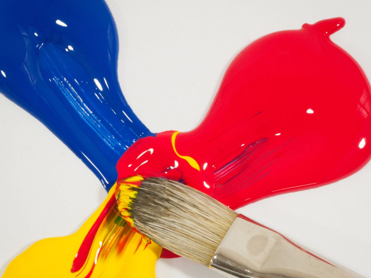
The primary colors—red, blue, and yellow—combine to form secondary colors (orange, green, and purple) and tertiary colors, which bridge the hues between primary and secondary colors.
A key concept in color theory is color harmony, which refers to the pleasing arrangement of colors. Harmony can be achieved by using complementary colors (opposites on the color wheel, like blue and orange), analogous colors (colors next to each other, such as blue, blue-green, and green), or monochromatic schemes (various shades of a single color).
Mastering these relationships empowers artists to design balanced, visually compelling compositions.

Creating Depth and Mood with Bold Colors
Bold color choices aren’t just about using bright or saturated colors; they’re about using color deliberately to create depth and emotion.
For example, warm colors like red, orange, and yellow can create a sense of energy, passion, or warmth, while cool colors like blue, green, and purple evoke calmness, serenity, or even melancholy.
By understanding the psychological impact of colors, artists can intentionally shape the viewer’s emotional response.
In the 20th century, artists like Henri Matisse and Mark Rothko pushed the boundaries of color use. Matisse’s bold colors transformed simple shapes into dynamic compositions, while Rothko used saturated blocks of color to elicit deep, emotional reactions.
Studying the works of these artists can be an invaluable way to learn how to use color boldly yet thoughtfully.

Tips for Incorporating Bold Colors
Experiment with color palettes. Start with a limited color palette to avoid overwhelming your composition. Try using complementary or analogous colors, which naturally work well together. Apps and online tools, like Adobe Color, can help you explore and build effective color schemes.
Use saturation and contrast. Bold color choices don’t necessarily mean high saturation. Experiment with contrast between saturated and muted colors to create a focal point and add depth. For example, a bright blue can pop against a muted yellow background.
Gradual shifts in value. Value, or the lightness and darkness of a color, can significantly impact the sense of depth. Gradual shifts in color value can create a sense of space and form, guiding the viewer’s eye across the artwork.
Test, observe, and adapt. Making bold color choices involves a degree of trial and error. Experiment with different color combinations, observe how they interact, and be open to adapting based on what resonates with your artistic vision.

Final Thoughts
Mastering color theory is more than knowing which colors work well together; it’s about using color strategically to enhance your art’s narrative and emotional impact. By incorporating bold color choices thoughtfully, artists can create memorable works that stand out and resonate with audiences.