
What Is the Three-Color Rule in Art?
If you’ve ever felt like your painting is getting noisy or unfocused, chances are you’re using too many colors without a clear structure. The three-color rule is a simple fix that’s been quietly guiding artists, designers, and even stylists for years.
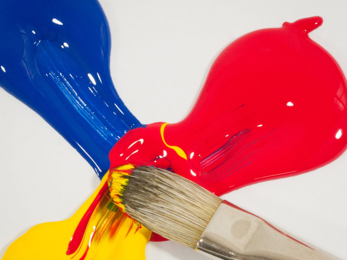
At its core, the rule is straightforward: limit your palette to three main colors. That’s it. But the real value comes from how you use those three.
Typically, you break it down like this:
- One dominant color (the one doing most of the work)
- One secondary color (supporting and balancing)
- One accent color (used sparingly to create contrast and focus)
This approach helps prevent visual overload. Instead of your viewer’s eye bouncing around the canvas, it has a clear path to follow. The result feels intentional.
Why It Works (and Why It Still Matters)
Limiting color forces decision-making. You stop relying on endless options and start thinking about relationships between hues. There’s also a psychological angle. Our eyes naturally prefer simplicity with a bit of variation. Too many competing colors can feel chaotic, while too few can feel flat. Three hits a sweet spot.
You’ll see a similar logic in interior design’s 60-30-10 rule: 60% dominant color, 30% secondary, 10% accent.
Painters don’t have to follow that ratio exactly, but the idea of uneven distribution is key. Equal parts of three colors often feel static. Let one lead.
How to Apply It in Painting
Start with a clear intention. Before you touch the canvas, decide your three-color structure.
For example:
- Landscape: muted green (dominant), warm earth tone (secondary), small hits of saturated orange (accent)
- Portrait: skin tones (dominant), cool background (secondary), sharp highlight color (accent)

You can build these palettes in a few ways:
- Use a triadic color scheme (three colors evenly spaced on the color wheel) for balance and energy
- Or keep it tighter with analogous colors plus one contrasting accent
Also, remember that neutrals like black, white, or raw canvas don’t always “count” as part of the three. They can act as buffers or breathing space.
A Historical Note
This idea isn’t new. The classic trois crayons technique used red, black, and white chalk to create remarkably rich drawings with just three tones. Artists like Peter Paul Rubens leaned on this limitation to sharpen focus and control.

When to Break the Rule
Like any rule in art, this one is a tool, not a law.
Once you understand it, you can stretch it. Add subtle variations. Push saturation. Layer glazes. Many advanced painters technically use more than three colors, but they still organize them as if they don’t.