What Is Toned Ground Painting?
You may have heard artists talk about “toned ground painting,” “colored ground,” or “imprimatura.” What is it exactly? And why should you care? Whether you’re just starting, teaching, or painting professionally, toned ground painting can shift how your work looks, feels, and how fast you get it done.
What Is a Toned Ground?
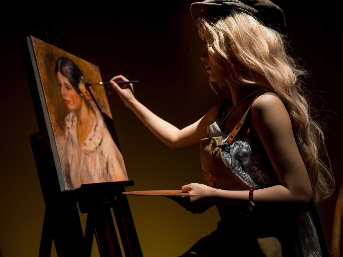
A toned ground is simply a canvas or panel that’s been covered with a uniform color before you start your main painting. Instead of starting on bright white, the surface is muted, stained, or painted with a mid-tone or neutral color (or sometimes a warm or cool tone) so that your paint sits on a foundation that already has some visual weight. This base color is called the “ground,” and when tinted, it becomes a “toned ground.” (“Ground” or primer is the layer between the support–canvas, wood, etc.–and your paint layers.)
An imprimatura is a related idea: a translucent or semi-transparent stain of ground color, often traditional in oil painting, that remains partially visible through subsequent layers.
Why Use Toned Ground?
Here are key benefits, based on recent writing and artist-practice
- Better value judgment early on. On white, everything you apply looks darker; mid-tones can be tough to see. A toned ground gives you room both above and below in value (lights and darks) from the start.
- Color harmony and unity. The tone you choose subtly influences all paint layers. If your ground is warm, warm colors feel integrated sooner. If neutral gray, you get less bias but gain control over temperature. The ground shows through in thin layers or at edges, pulling things together visually.
- Less glare, easier on the eyes. A bright white surface can glare under studio lighting. A toned ground is gentler, reducing eye fatigue and helping you see color and value relationships more reliably. The contrast between ground and paint isn’t so extreme.
- Speed and cohesion. Because there’s already a base color, you can block in shadows and lights more quickly. Some artists say their compositions come together faster and feel more cohesive early in the process.

Choosing the Right Tone
Not every tone works for every painting. Here are some tips:
- Aim for mid-tone, not too dark, not too light. Too dark ground may force you to build up lighter values a lot; too light and you lose the benefit.
- Think about mood, environment, and subject matter. Warm earthy tones (burnt umber, sienna) for warm light scenes; neutral greys for more muted, balanced works; sometimes a blue or cool tone helps if you have a sky or shadow-heavy piece.
- Experiment with opacity. You can apply the ground opaquely, or as stain/imprimatura (thin wash) so it remains visible under your layers.
Possible Drawbacks
- If your paint is too opaque, or you cover the ground completely, the ground effect may disappear.
- A ground tone that’s too strong might distort your sense of color or force you to adjust each hue more.
- Extra step: hand applying tinted ground takes time and extra materials.
When to Use Toned Ground
- Portraits, still lifes, landscapes where lighting or atmosphere is key.
- When you want faster value mapping (shadows/highlights) or tighter unity early.
- If studio lighting is harsh or natural light variable–toned ground can help with consistency.